This exhibition was a great opportunity for us 5 artists (Myself, Lydia Jackson, Cherelle Khan, Charlotte Robinson and Rebecca Smith) to explore curating and working within a gallery space.I find that as a group, the five of us work well together and always create a show that is different and interesting. The work we create is entirely individual yet somehow we manage to make links to one another (apart from the colour Blue in this instance). Being so close to the last exhibition, ‘Fringe Aesthetics’ this exhibition forced us to keep motivated and create new work as we had to produce artwork around the colour blue. The only thing that we missed out with in this exhibition was naming the individual artworks, it is something to think carefully about.
I gained feedback on my artwork which i can now develop into my other works i am going to explore for my degree show in a few months time. Both positive and constructive to develop and think about when i next hang my artwork.
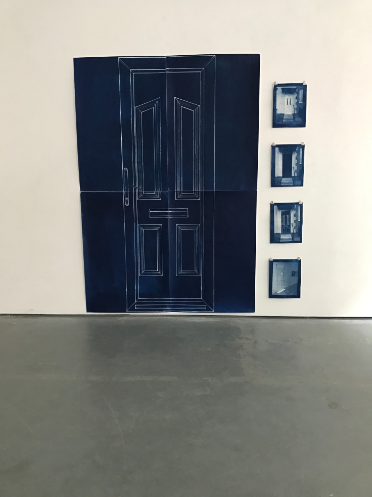
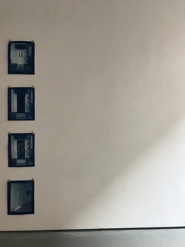
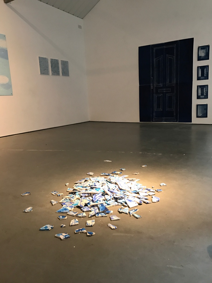
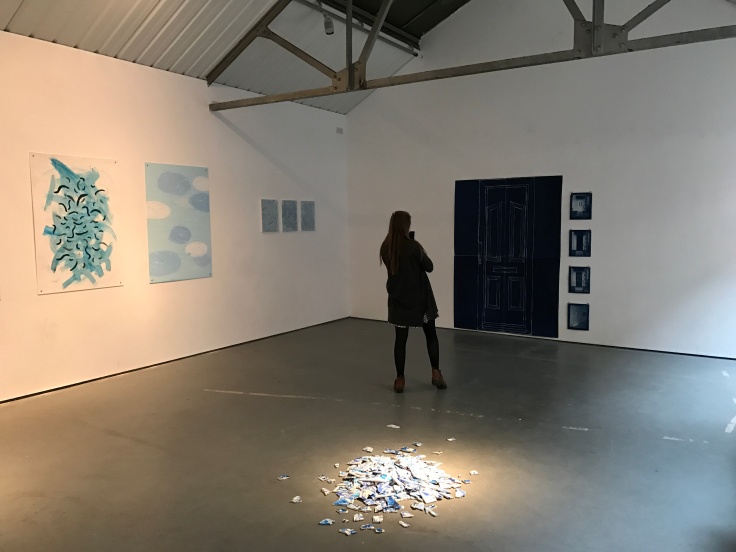
The full display. 4 X A1, 4 X A4 cyanotype blue prints. A1 pieces create one large image of a to scale house door – developed from ‘Front Door’ artwork. A4 pieces are photographic cyanotypes- individual photos in a series that could explore narrative.
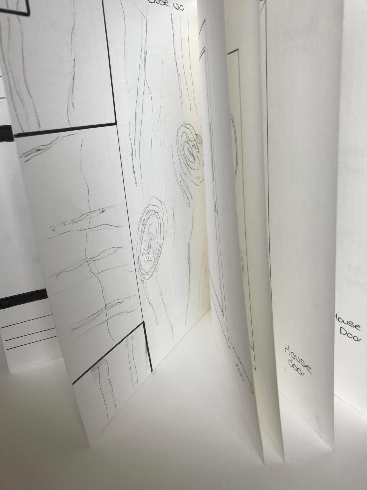
close up
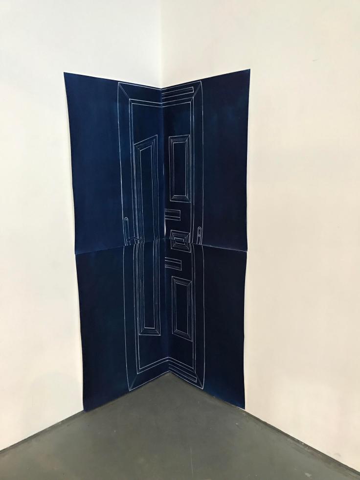
displayed in the corner – using the gallery shape
scale
The images above show my experimentation with hanging the large A1 printed house door into the corner of the gallery. I wanted to uses the architecture of the room to experiment with the cyanotype illustration of the house door,(cyanotype linked with architecture for architectural drawings). It was interesting to see the different perspective of the flat image and how it folds with the shape of the room.
Here i experimented with mixing the pieces to the door up when hanging the art. This was interesting as it left me with an illustration that looks like a door, yet does not. The piece looks surreal and that is not just because it is hung in the corner of the gallery on two walls. it is interesting to see how the panels aligned when they were placed mixed up.Close up. This photo shows a close up of the images on the A4 cyanotypes. Top to bottom can be read as a narrative exploring liminality and space. All my own photos printed as blue prints. TOP and BOTTOM image have not been edited. MIDDLE TWO cyanotypes have been edited and added to on photoshop and in the printing process.
Myself and fellow Creative Art Students, Lydia Jackson, Cherelle Khan, Charlotte Robinson and Rebecca Smith decided it would be a great opportunity to curate another group exhibition together. In the Studios, was a poster advertising proposals to get a week residency at BLOC Projects studio space in Sheffield. Together we sent in a proposal and was selected for a weeks residency in the gallery space to put on an exhibition.
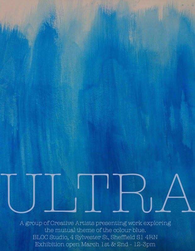
When we wrote the proposal, we wanted to collectively link our artwork together instead of us all doing our own thing in the gallery. Instead of forcing a new idea to do work around as a group, we therefore decided to unite our work by a colour theme which would enable us to do our own practice yet as a collected exhibition. The colour we chose was Blue. The name of the exhibition is ‘ULTRA’ and will not be having an opening night as we are using this as an opportunity to experiment with hanging work in a gallery space. However, the gallery is open to the public March 1st and 2nd 12-3pm.
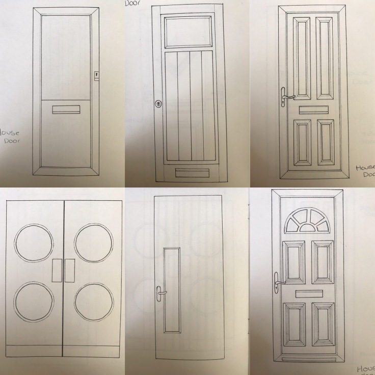
A5 sketchbook – door studies, close up detail drawings, Fine liner pen
As part of my research, i have been drawing studies of different house doors. Each being slightly different. This is to gain a better understanding of the object and the components of the door, also to see the composition of the components on different door (e.g. the handle, panels…).
These studies are all drawn in an A5 sketchbook with a door on each page. Not only have i drawn doors but i have also drawn on some pages close up details and components that work with the object such as a key.
I have recently created an instagram account to show my artwork and my art practice. This is a great platform to document my work and also see how my practice has developed throughout the years.
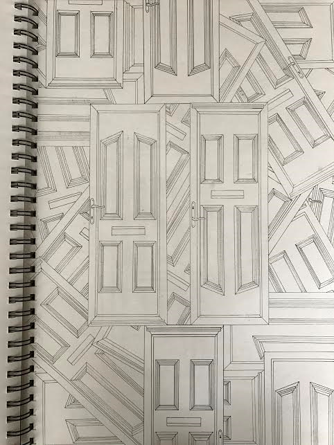
(IMAGE IS MY OWN PHOTO) A3 line drawing, fine liner pen illustration
Following on from writing my dissertation and having Tutorials, I have become interested in Surrealism and am trying to incorporate some surreal elements into my current studio practice. Here is a drawing I have done which I quite like and find it interesting to look at and think what is actually going on in the piece. I have drawn My house door illustration that I have been working with multiple times in different directions and perspectives layered on top of one another. Doors the correct way, upside down, horizontal and on their sides as well as half doors, this piece undermines what we understand doors to be viewed as in reality.
S.I.A Gallery, Fringe Aesthetic Exhibition, 2017, Preparation for displaying Beyond Boundaries. (IMAGE COURTESY OF CHELSEA ABBOTT).
(IMAGES ARE MY OWN PHOTOS)
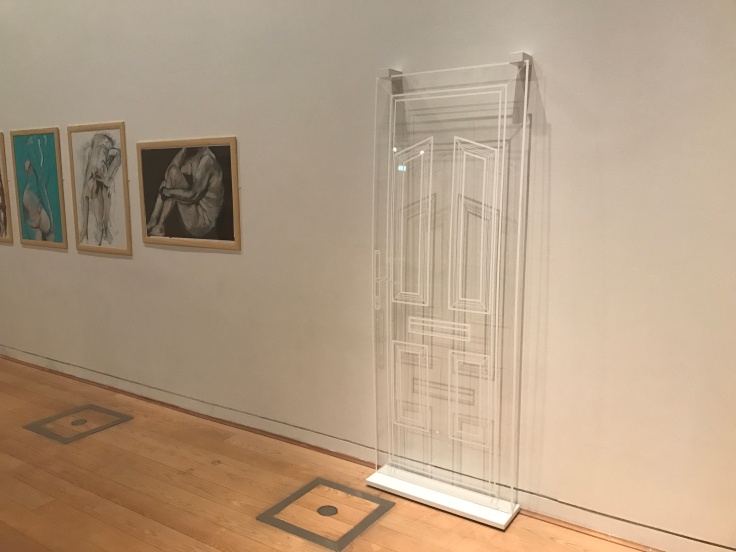
The images below show the display of my artwork, Beyond Boundaries:
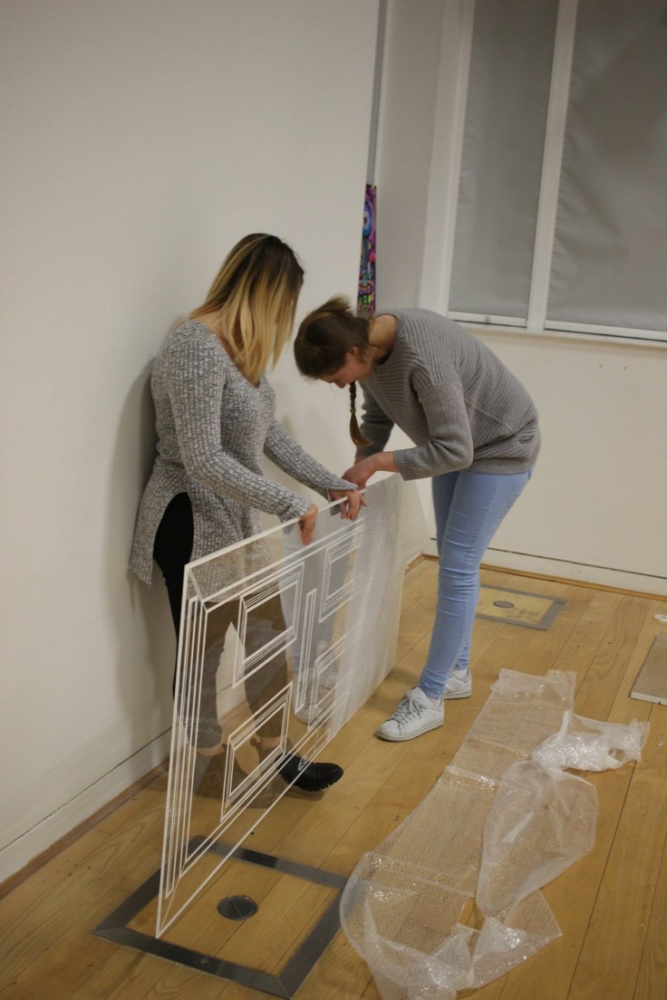
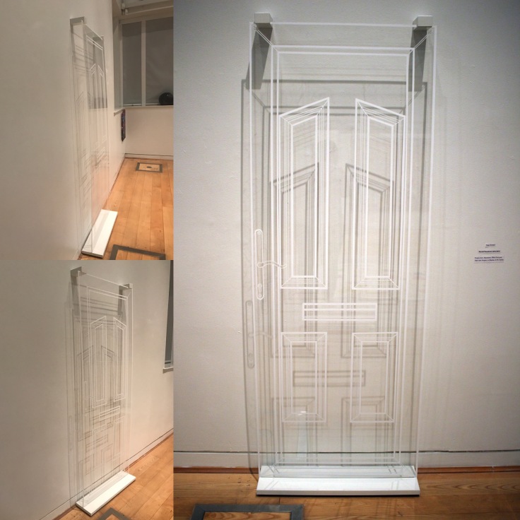
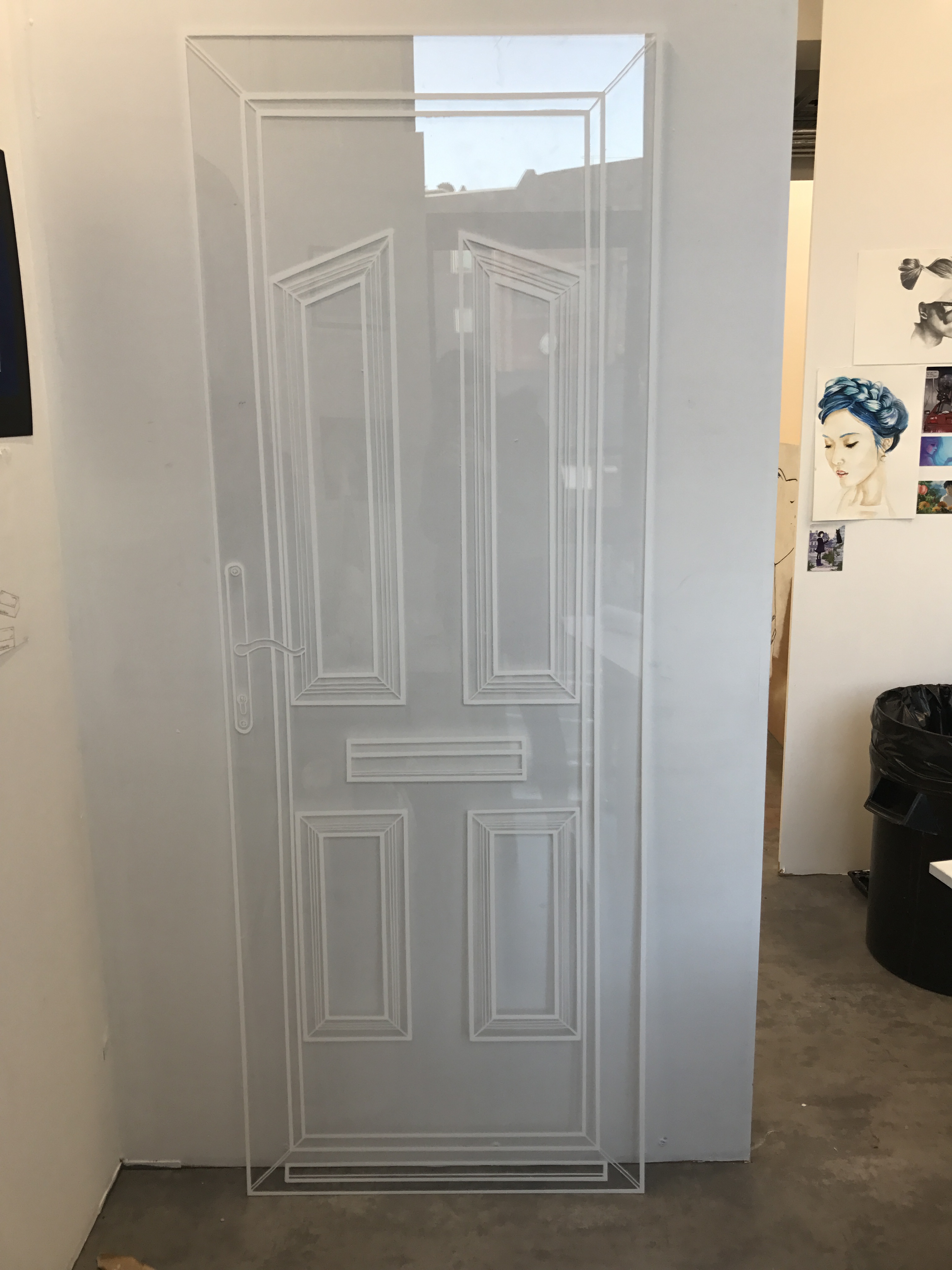
To scale perspex door illustration, white Posca Pen on 5mm clear perspex. W-29 inches – H-78.5 inches.
Exploring unseen boundaries and questioning liminality, this perspex door that has domestic ties looks into space beyond the object itself.
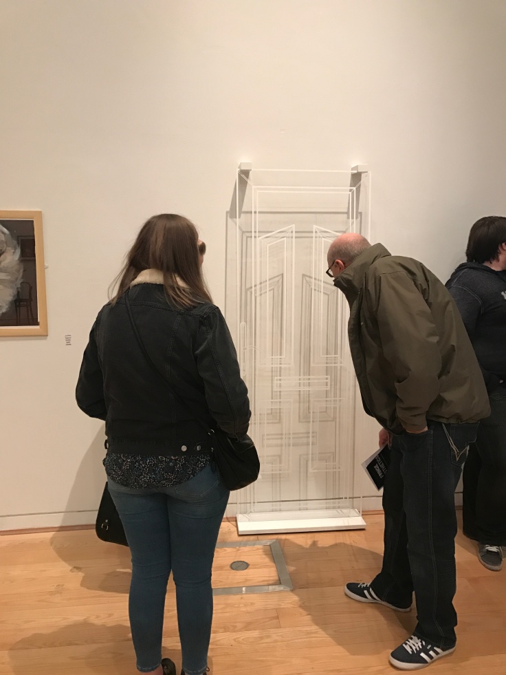
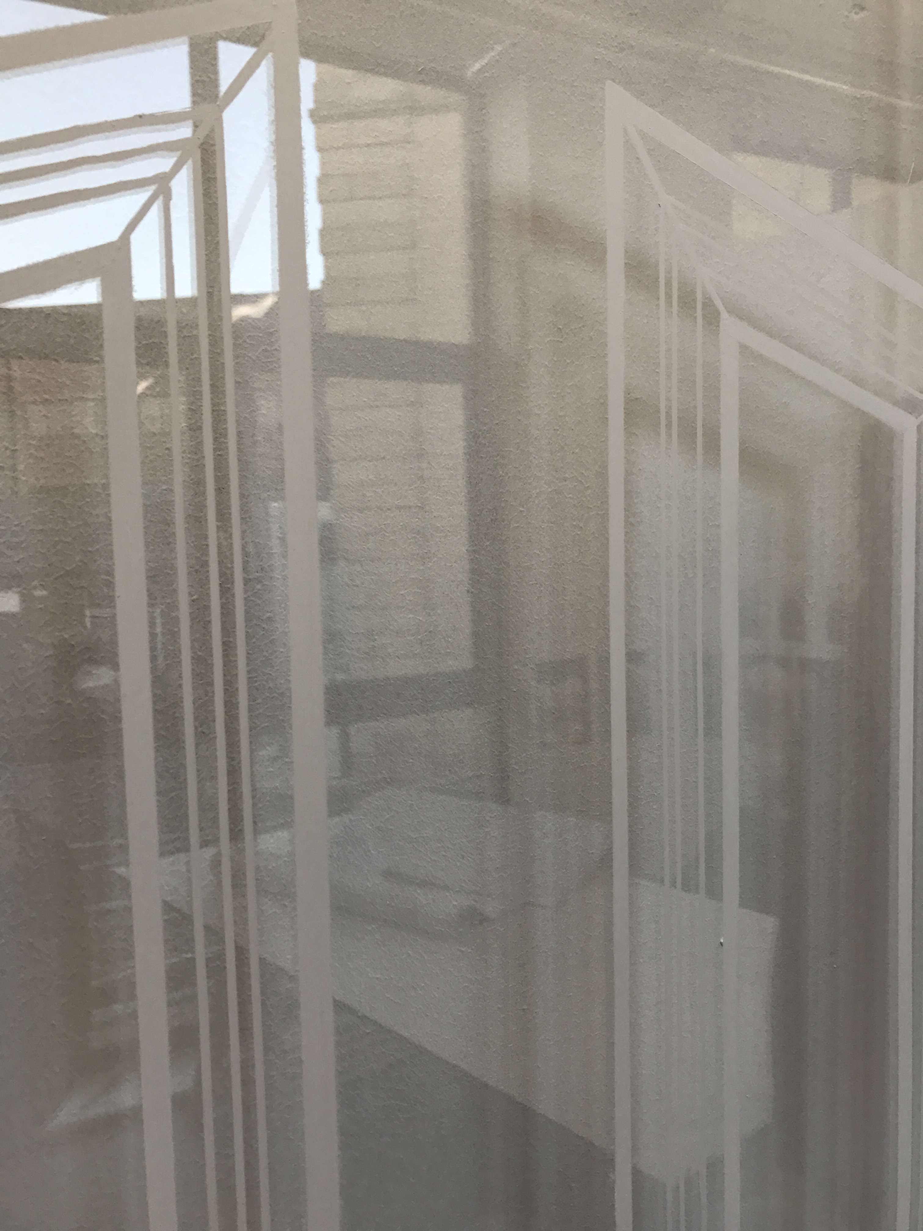
S.I.A Gallery, Fringe Aesthetics, 2017. Creative Art Practice Interim exhibition. ‘Beyond Boundaries’-2017 display.S.I.A Gallery, Fringe Aesthetics, 2017, Creative Art Practice interim exhibition, ‘Beyond Boundaries’, 2017 display.S.I.A Gallery, Fringe Aesthetics, 2017, Creative Art Practice exhibition, ‘Beyond Boundaries’, 2017 display. Audience viewing my artwork at the opening night.
I was really pleased with this exhibition, the gallery was perfect to display art and i feel it suited my artwork, ‘Beyond Boundaries’ nicely. Although my art was a risk as i do not usually work with 3D work, i was pleasantly surprised with the end result seeing the artwork displayed in a gallery. I felt the piece worked well in how i envisioned the artwork in the design process (See previous post – Artwork for Fringe Aesthetics), and it looked aesthetically pleasing. the only change i would like to develop with how this work was displayed would be to alter the lighting to develop the shadow more central on the wall, being a spotlight the shadow formed slightly off the artwork which made it slightly difficult to view.
The artwork explores psychological space in a surreal manner, the overall presentation was to appear as if the door had a presence but is not necessarily real (clear- transparent – shadow). It questions liminality and what lies beyond the door, i wanted the audience to view beyond the door into the psychological space it creates in their own mind.
I received many of feedback about my art that i can now take forward and expand on, overall i really enjoyed displaying my work in Fringe Aesthetics.
This artwork is a development from my previous piece, ‘Front Door’. This, like ‘Front Door’ was an experimental piece that symbolizes home space, however i have experimented with creating the object of the door to be transparent evoking more questions about the object know to be a divider between public and private space. Drawn in white to blend with a gallery environment – is it there?, is it real?
Not only this, i have experimented with the theory of liminality with this artwork in relation to the object of the door., What is the liminal space beyond the threshold in which a door would sit? I have created this piece and experimented with shadow to explore your own interpretation of the space that lies beyond this door in the personal psychological space imagined by the artwork viewers.
(ALL IMAGES MY OWN PHOTOS)
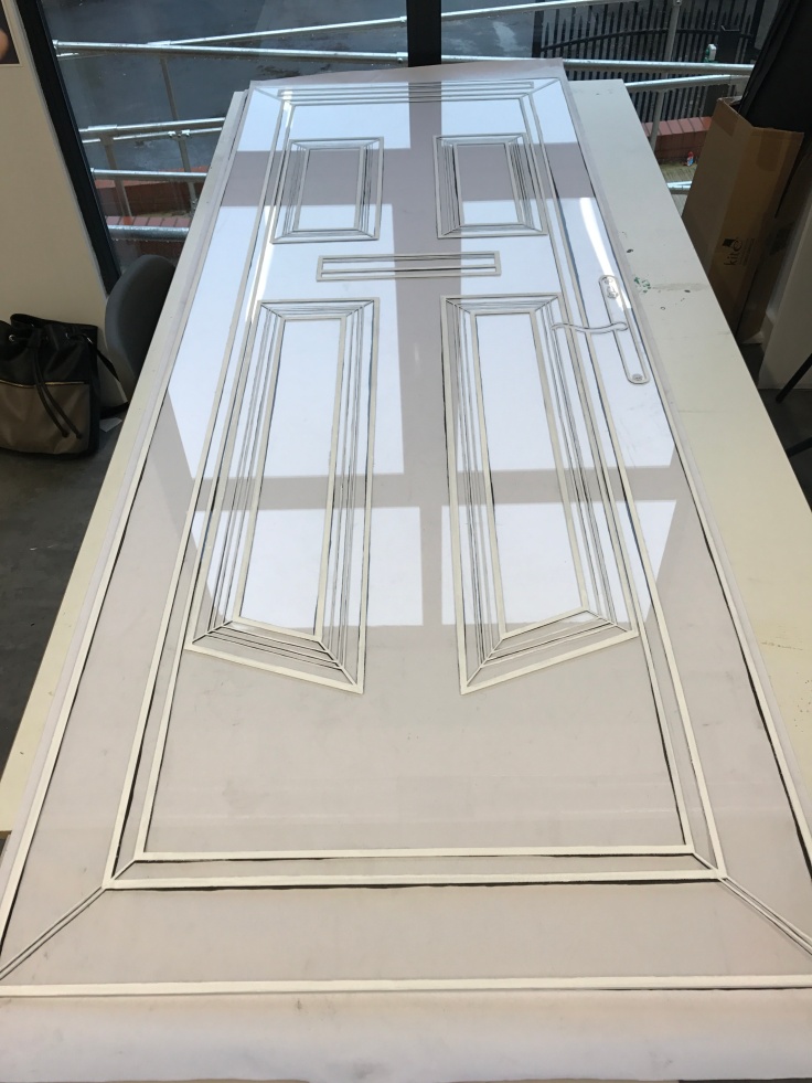
Beyond Boundaries (Displayed here in Fringe Aesthetics Exhibition). To scale clear transparent illustrated door -5mm thick, W-29 inches – H-78.5 inches. White Posca Pen Acrylic.Beyond Boundaries – creation process, white Posca Pen, Acrylic illustrated door on 5mm thick transparent perspex, W-29 inches – H78.5 inches.Beyond Boundaries – creation process, to scale transparent perspex door- 5mm thick, illustrated white Posca Pen Acrylic. W-29 inches – H-78.5 inches. Beyond Boundaries- close up, shadow formed behind the perspex on the wall.